

For subscribers of our “Daily Trading Signals”, we now also include a “Weekly Market Report”, where we provide a weekly deep-dive on the market, including fundamentals, technicals, economics, and portfolio management:
Click here for last week’s market report (7 August 2023)
Click here to subscribe for the latest market report (14 August 2023)
Click here to see the archives of all our past market reports
Market Recap & Upcoming Week
Last week witnessed significant tremors in the banking sector as Moody’s made the call to downgrade ten regional banks, eliciting concerns about the banking industry’s robustness in light of escalating interest rates and previous bank defaults. This decision, causing a roughly 3% drop in major bank indices, stemmed from factors such as deteriorating assets and the Federal Reserve’s moves to combat inflation.
While these banks maintain their investment-grade status, whispers from Moody’s hint at re-evaluating ratings for other colossal institutions. This sparked apprehensions about depreciating bonds, heightened withdrawal rates, and wary investors. Conversely, some analysts argue that the sector remains on solid ground, considering the recent stock downturn as a transient repercussion.
For last week’s CPI data, July’s cooling inflation hinted at the Federal Reserve rethinking rate hikes.
For this coming week, major retailers like Walmart, Home Depot, and Target are set to release their reports, providing insights into the retail sector’s performance. Moreover, the Census Bureau will unveil July’s nationwide retail sales data on Tuesday, shedding light on the robustness of consumer spending. Meanwhile, all eyes will be on the Federal Reserve come Wednesday when they disclose the minutes from the recent FOMC meeting, potentially hinting at the future course of monetary policy.
The housing market is also in the spotlight with updates on building permits, July housing starts, and the NAHB’s Housing Market Index for August, which will offer a comprehensive picture of the real estate scenario. To top it off, brace yourself for significant global economic insights as we receive inflation and GDP data from powerhouses like the U.K., eurozone, and Japan. It’s a week packed with key indicators that could shape market sentiments, so stay informed and vigilant!
Daily Trading Signals (Highlights)
We cover 3 main markets with a total of 200+ counters, so we will never run out of trading opportunities:
- Forex, CFDs, commodities, bonds
- US stocks, ETFs, global stock indices
- Cryptocurrencies, crypto indices
By covering a broad range of markets, we can focus our attention (and capital) on whichever market currently gives the best returns.
Subscribe for real-time alerts and weekly reports:
👉🏻 https://synapsetrading.com/daily-trading-signals
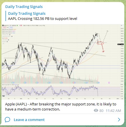
Apple (AAPL) – After breaking the major support zone, it is likely to have a medium-term correction.

AUDUSD – After breaking the major support, price momentum is currently bearish.
We can ride the momentum downwards for now (short-term trade), but if prices make a sudden U-turn back into the range, be prepared to do range trading.

NASDAQ 100 (US100) – Prices are having a pullback to support, might be a good opportunity for a short-term buy trade, if there is a bullish trigger.

USDCNY – Prices have rebounded off support, and may soon break new highs.
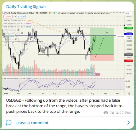
USDSGD – Following up from the videos, after prices had a false break at the bottom of the range, the buyers stepped back in to push prices back to the top of the range.
