Market analysis, insights and trading ideas on various markets and products!

What Is a Bullish Harami?

A bullish harami is a basic candlestick chart pattern indicating that a bearish trend in an asset or market may be reversing.

This pattern is often used by traders to identify potential points of reversal and may signal a shift from a downward trend to an upward trend.

Understanding a Bullish Harami

The bullish harami pattern is a candlestick chart indicator suggesting that a bearish trend may be coming to an end.

It is generally identified by a small increase in price, represented by a white candle, that is contained within the downward price movement of the previous days, shown by black candles.

This pattern is important for traders and investors as it may signal an opportunity to enter a long position on an asset.

A candlestick chart, which this pattern is based on, is a type of chart used to track the performance of a security.

Named for its rectangular shape with lines protruding from the top and bottom, the chart resembles a candle and wicks.

The candlestick chart typically represents the price data of a stock on a single day, including opening price, closing price, high price, and low price.

To identify a harami pattern, investors must first examine daily market performance as reported in candlestick charts.

The harami pattern emerges over two or more days of trading.

A bullish harami relies on the initial candles to indicate that a downward price trend is continuing and that the bearish market is pushing the price lower.

The bullish harami is characterized by a long candlestick followed by a smaller body, often referred to as a doji, which is completely contained within the vertical range of the previous body.

The word “harami” comes from an old Japanese word meaning “pregnant,” which is visually represented by the pattern where a smaller body is contained within the previous day’s candle, resembling a pregnant woman.

For a bullish harami to be confirmed, the smaller body on the subsequent doji should close higher within the body of the previous day’s candle.

This signals a greater likelihood that a reversal will occur.

Bullish Harami, Bearish Harami, and Advanced Candlestick Patterns

While the bullish harami signals a potential reversal in a bearish trend, its counterpart, the bearish harami, suggests the opposite: a potential reversal in a bullish trend.

Both patterns are essential tools in candlestick chart analysis, which offers a wide range of patterns to predict future trends.

These include basic patterns like bullish and bearish crosses, evening stars, rising threes, and engulfing patterns.

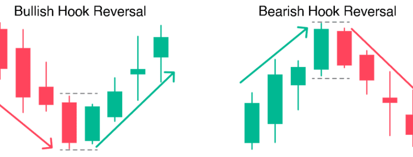
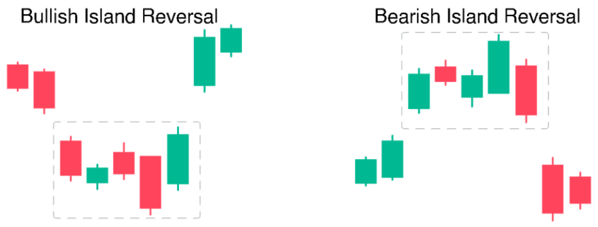
For those seeking deeper insights, advanced candlestick patterns such as island reversal, hook reversal, and san-ku or three gaps patterns can provide more detailed analysis and predictions.

Concluding Thoughts

The bullish harami is a valuable pattern for traders looking to spot potential reversals in a bearish trend.

While it offers a straightforward signal, it should be used in conjunction with other technical indicators and analysis to confirm the trend reversal.

Understanding and recognizing this pattern can help traders make more informed decisions and capitalize on emerging market opportunities. As with all trading strategies, a well-rounded approach that includes various tools and indicators will enhance the reliability of the pattern and improve overall trading outcomes.

What Is a Bearish Engulfing Pattern?

In technical analysis, the bearish engulfing pattern is a chart pattern that can signal a reversal in an upward price trend.

Comprising two consecutive candles, the pattern features a smaller bullish candle followed by a larger bearish candle that engulfs the first.

This formation is considered a strong indicator that the prior upward momentum is waning and a reversal is on the horizon.

Understanding the Bearish Engulfing Pattern

The bearish engulfing pattern is a two-candle reversal pattern.

The second candle completely engulfs the body of the first one, signaling a potential shift in market sentiment from bullish to bearish.

For the pattern to be valid, the body of the down candle must engulf the up candle, meaning the high must be higher, and the low must be lower than the previous candle.

This pattern is more significant if it occurs after a price advance, indicating that the uptrend may be losing strength and a downtrend could be imminent.

Interpreting the Bearish Engulfing Pattern

The bearish engulfing pattern serves as a warning sign, signaling a potential reversal from a bullish to a bearish trend.

It indicates a sudden shift in market sentiment where sellers have overtaken buyers.

When this pattern appears after an uptrend, it suggests that the bullish momentum is weakening.

This pattern is often an early indicator that a downtrend may be on the horizon.

For investors holding long positions, it can be a signal to consider exiting or tightening stop-loss levels.

For traders shorting the asset or market, this pattern can mark a good entry point, though additional confirmation is typically needed.

The Psychology Behind the Bearish Engulfing Pattern

The psychology behind the bearish engulfing pattern reflects the shifting dynamics between buyers and sellers.

Initially, there is optimism as the pattern usually occurs after a period of upward price movement, indicating that buyers have been in control.

The small bullish candle suggests that buyers still expect the upward trend to continue.

The appearance of a large bearish candle that engulfs the previous bullish candle signals a change in sentiment.

This indicates that sellers have entered the market with enough force to overshadow the previous gains.

This shift can prompt those holding long positions to sell and exit, while bearish traders may see this as an opportunity to enter short positions.

Both bears and bulls may seek additional confirmation that the pattern signifies what it suggests.

If the price continues to move downward after the pattern, it would validate the bearish sentiment, reinforcing the likelihood of a downtrend.

Trading the Bearish Engulfing Pattern

The bearish engulfing pattern is often used as a technical signal for a potential reversal from bullish to bearish sentiment.

This pattern is typically seen at the end of an uptrend and can be more significant when accompanied by high trading volume.

To confirm the bearish signal, traders can wait for a subsequent bearish candle in the next session or look for a gap down, where the opening price is lower than the previous session’s closing price.

Additional technical tools, such as moving averages or RSI, can be used to confirm the bearish signal.

For example, a crossover in MACD or an RSI heading below 70 could provide additional confirmation.

When trading this pattern, traders typically initiate a short position after confirming the bearish signal, with a stop loss set above the highest point of the engulfing candle.

The Pros and Cons of Using the Bearish Engulfing Pattern

The bearish engulfing pattern offers several advantages as an early warning signal and is relatively easy to identify.

It is versatile and can be applied across various time frames and markets.

However, the pattern is not without its drawbacks.

It can produce false signals, especially in choppy markets, and often requires additional confirmation, which can delay action.

Moreover, it is a lagging indicator, as it forms after price changes have occurred.

Concluding Thoughts

The bearish engulfing pattern is a valuable tool for traders looking to identify potential reversals in an uptrend.

While it is a powerful signal, especially when confirmed by other technical indicators, it should not be relied upon in isolation.

The pattern’s effectiveness can vary depending on the context, and it often requires additional confirmation to reduce the risk of false signals.

As with any trading strategy, proper risk management and a well-rounded approach are essential when incorporating the bearish engulfing pattern into your analysis.

What Is a Bullish Engulfing Pattern?

A bullish engulfing pattern is a white candlestick that closes higher than the previous day’s opening after opening lower than the previous day’s close.

It can be identified when a small black candlestick, showing a bearish trend, is followed the next day by a large white candlestick, showing a bullish trend, the body of which completely overlaps or engulfs the body of the previous day’s candlestick.

A bullish engulfing pattern may be contrasted with a bearish engulfing pattern.

bullish engulfing

Understanding a Bullish Engulfing Pattern

The bullish engulfing pattern is a two-candle reversal pattern.

The second candle completely ‘engulfs’ the real body of the first one, without regard to the length of the tail shadows.

This pattern appears in a downtrend and is a combination of one dark candle followed by a larger hollow candle.

On the second day of the pattern, the price opens lower than the previous low, yet buying pressure pushes the price up to a higher level than the previous high, culminating in an obvious win for the buyers.

What Does a Bullish Engulfing Pattern Tell You?

A bullish engulfing pattern is not to be interpreted as simply a white candlestick, representing upward price movement, following a black candlestick, representing downward price movement.

For a bullish engulfing pattern to form, the stock must open at a lower price on Day 2 than it closed at on Day 1.

If the price did not gap down, the body of the white candlestick would not have a chance to engulf the body of the previous day’s black candlestick.

Because the stock both opens lower than it closed on Day 1 and closes higher than it opened on Day 1, the white candlestick in a bullish engulfing pattern represents a day in which bears controlled the price of the stock in the morning only to have bulls decisively take over by the end of the day.

The white candlestick of a bullish engulfing pattern typically has a small upper wick, if any.

That means the stock closed at or near its highest price, suggesting that the day ended while the price was still surging upward.

This lack of an upper wick makes it more likely that the next day will produce another white candlestick that will close higher than the bullish engulfing pattern closed, though it’s also possible that the next day will produce a black candlestick after gapping up at the opening.

Because bullish engulfing patterns tend to signify trend reversals, analysts pay particular attention to them.

Bullish Engulfing Pattern vs. Bearish Engulfing Pattern

These two patterns are opposites of one another.

A bearish engulfing pattern occurs after a price moves higher and indicates lower prices to come.

Here, the first candle in the two-candle pattern is an up candle.

The second candle is a larger down candle, with a real body that fully engulfs the smaller up candle.

Limitations of Using Engulfing Patterns

A bullish engulfing pattern can be a powerful signal, especially when combined with the current trend; however, they are not bullet-proof.

Engulfing patterns are most useful following a clean downward price move as the pattern clearly shows the shift in momentum to the upside.

If the price action is choppy, even if the price is rising overall, the significance of the engulfing pattern is diminished since it is a fairly common signal.

The engulfing or second candle may also be huge.

This can leave a trader with a very large stop loss if they opt to trade the pattern.

The potential reward from the trade may not justify the risk.

Establishing the potential reward can also be difficult with engulfing patterns, as candlesticks don’t provide a price target.

Instead, traders will need to use other methods, such as indicators or trend analysis, for selecting a price target or determining when to get out of a profitable trade.

Concluding Thoughts

The bullish engulfing pattern is a widely recognized signal that can indicate a potential trend reversal.

However, it should not be relied upon in isolation.

Traders must consider the broader market context and use additional technical indicators to confirm the pattern’s validity.

While powerful, the pattern also comes with limitations, particularly in volatile markets where it may be less reliable.

Proper risk management and a clear exit strategy are essential when trading based on bullish engulfing patterns.

The on neck pattern occurs when a long real-bodied down candle is followed by a smaller real-bodied up candle that gaps down on the open but then closes near the prior candle’s close.

The pattern is called a neckline because the two closing prices are the same (or almost the same) across the two candles, forming a horizontal neckline.

On Neck Pattern

The pattern is theoretically considered a continuation pattern, indicating that the price will continue lower following the pattern.

In reality, that only occurs about half the time.

Therefore, the pattern also often indicates at least a short-term reversal higher.

The on neck pattern occurs during a downtrend, or a pullback within an uptrend, when a bearish candle with a long real body is followed by a smaller bullish candle that fails to close above the bearish candle’s close.

The small bullish candle could take any number of forms, such as a doji, rickshaw man, or any bull candle with a smaller real body than the prior candle, but the closing prices of the two candles should be equal or nearly equal.

The pattern shows bulls attempting a rally that ends up fizzling out on the second candle, unable to push the close above the prior candle’s close.

Theoretically, it is expected that the price will continue lower following the pattern.

According to the Encyclopedia of Candlestick Charts by Thomas Bulkowski, the price only continues to the downside 56% of the time.

The rest of the time it will be acting as a reversal pattern to the upside.

Bulkowski’s study found that while the price did tend to continue lower more often, when the price did reverse to the upside, the ensuing move was larger.

Therefore, traders may prefer to actually watch for a move higher following the pattern to signal an upside reversal.

These types of up moves tend to be slightly larger than declines that follow the pattern.

Traders should use the on neck pattern in conjunction with other forms of technical analysis, such as chart patterns or technical indicators.

This is because the pattern could result in a move in either direction, so confirming data may help signal which direction that is likely to be.

Traders also have the option of waiting for confirmation candles.

Confirmation candles are the candles that follow the pattern, moving either up or down, alerting the trader which direction the price could move further.

For example, if the pattern forms and then the price drops below the low of the second candle, that could be interpreted as confirmation that the price is heading lower.

In the psychology behind the on neck pattern, the security is engaged in a primary downtrend or a major pullback within a primary uptrend.

The first candle posts a long black real body.

This weak price action increases bearish complacency while forcing weakened bulls into full retreat.

The security gaps down on the second candle and sells off to a new low, but buyers take control and are able to lift the price to the prior close but not above it.

The bears see that the bulls lacked the power to push the price above the prior close.

The theory is that the bears will take control over the next several candles, pushing the price lower.

However, as discussed, in reality, this only occurs about half the time.

Thus the pattern puts both bears and bulls on edge, resulting in essentially a coin flip as to whether prices will go higher or lower following the pattern.

An example of the on neck pattern can be seen on the daily chart of Apple Inc. (AAPL), where two on neck patterns occurred during pullbacks within an overall uptrend.

In this case, the price proceeded higher following the pattern.

Once the price started to move up following the pattern, a stop loss could be instituted below the pattern to control risk in the event the price started to decline again.

The difference between the on neck pattern and counterattack lines lies in their structure.

Counterattack lines are very similar to the on neck pattern, except that with counterattack lines the down candle and up candle have real bodies of similar size.

In the on neck pattern, the second candle is smaller.

In theory, the on neck pattern is a continuation pattern, while counterattack lines are a reversal pattern.

However, the on neck pattern has its limitations.

Following the pattern, the price could move higher or lower with nearly equal odds.

Moves to the upside following the pattern tend to be larger than moves to the downside.

Trading based on the pattern could result in any number of variations.

While a breakout lower is relatively easy to define as a drop below the low (or close) of the second candle, the trader will need to decide if they view a move above the high (or close) of the second candle or first candle as the breakout point higher.

A method of profit-taking must be devised as the candlestick pattern doesn’t have an inherent profit target.

The pattern is best used in conjunction with confirming evidence from other technical indicators and methods.

The up/down gap side-by-side white lines is a continuation pattern that can signal the persistence of the current trend, either upward or downward.

While it is a moderately reliable indicator, its rarity and the often muted price movements following its occurrence mean that it should be used in conjunction with other technical analysis tools.

The up version is a large up (white or green) candle followed by a gap and then two more white candles of similar size to each other.

Up Gap Side By Side White Lines

The down version is a large down (black or red) candle followed by two white candles of similar size.

Down Gap Side By Side White Lines

When the pattern occurs, which is rare, it is expected that the price will continue moving in the current trend direction—down or up, as the case may be.


The up gap side-by-side white lines is a bullish continuation pattern with the following characteristics:

The market is in an uptrend.

The first candle is a white candle.

The second candle opens above the close of the first candle (gap up).

The third candle has a real body with the same length as the second candle with an open that’s at the same level or higher than the real body of the first candle.


The down gap side-by-side white lines is a bearish continuation pattern with the following characteristics:

The market is in a downtrend.

The first candle is a black candle.

The second candle is a white candle that opens below the close of the first candle (gap down).

The third candle is a white candle with a real body that’s the same length as the second candle and opens at the same level or lower than the real body of the first candle.


The side-by-side white lines pattern is moderately accurate in predicting a continuation of the current trend, but it is somewhat uncommon.

A continuation occurs 66% of the time.

The pattern doesn’t always produce large price moves.

A little over 60% of the patterns produced a 6% average move in 10 days, and those patterns occurred in downtrends with a downside breakout from the pattern (downtrend continuation).

Patterns occurring in other contexts didn’t have price moves as large, according to Thomas Bulkowski’s candlestick research.

Other chart patterns or technical indicators should be used to confirm the candlestick pattern to maximize the odds of success.

Many traders opt to wait for confirmation from the pattern.


Confirmation is price movement that confirms the expectation of the pattern.

For example, following an up gap side-by-side white lines pattern, a trader may wait for the price to move above the highs of the pattern before initiating a long position.

A stop loss could then be placed below the low of the second or third candle or even the first candle in order to give the trade more room.

The difference between up/down gap side-by-side white lines and a three outside up/down candlestick pattern is that, unlike the former pattern, the latter is a reversal pattern, not a continuation pattern.

In the outside up pattern, a black candlestick is followed by two white candles.

In the outside down pattern, a white candle is followed by two black candles.

Up/Down Gap Side-by-Side White Lines Psychology

Up — Suppose the security is engaged in an uptrend, with confident bulls expecting higher prices.

The first candle shows a rally with a large real body and a close higher than the open.

Bull confidence increases further on the second candle, with an up gap and positive intraday price action that holds a higher high into the closing bell.

Bullish resolve is tested on the third candle, which opens with an initial drop into the opening price of the second candle.

However, the decline fails to gain traction and buyers lift the security back to the high of the second candle by the close.

This reveals diminishing bear power, raising odds for a rally and new high on the next candle.

Down — Suppose the security is engaged in a downtrend, with confident bears expecting lower prices.

The first candle posts a sell-off bar with a large real body and a close lower than the open.

Bear confidence is shaken on the second candle, with a down gap and strong intraday price action that holds below the gap into the closing bell.

Bearish resolve grows on the third candle, which opens with a down gap into the opening price of the second candle.

Once again strong intraday price action fails to pierce gap resistance.

This reveals diminishing bull power, raising odds for a decline and new low on the next candle.

Up/Down Gap Side by Side White Lines Limitations

The pattern is rare, which means finding it and opportunities to use it will be limited.

The pattern has moderate reliability, which means that ideally the candlestick pattern should be coupled with other forms of analysis and confirmed by other trade signals.

Following the pattern, the pattern that tended to produce large price moves was the down gap version occurring in a downtrend.

The pattern served to act as a downtrend continuation pattern.

This pattern, and candlestick patterns in general, don’t provide a price target.

It is up to the trader to determine when they will exit a profitable trade.

Waiting for price confirmation following the pattern is recommended.