For subscribers of our “Daily Trading Signals”, we now also include a “Weekly Market Report”, where we provide a weekly deep-dive on the market, including fundamentals, technicals, economics, and portfolio management:
Click here for last week’s market report (14 August 2023)
Click here to subscribe for the latest market report (21 August 2023)
Click here to see the archives of all our past market reports
Market Recap & Upcoming Week
Last week, despite a majority of S&P 500 companies surpassing analysts’ expectations, the market didn’t reflect the enthusiasm. Approximately 79% exceeded forecasts, yet shares for companies outperforming expectations saw a meager 0.5% rise, a significant decrease from the 10-year average.
Even giants like Apple and PayPal experienced a decline in stock value post reporting above-anticipated earnings. The decline in the S&P 500 by 2.7% in August points to growing concerns about stock valuations, potential recessions, and weakening consumer strength.
Meanwhile, China’s property market continued its descent, severely impacting stocks in both Hong Kong and mainland China. The Hang Seng Index and the CSI 300 were hit hard, further aggravated by Country Garden Holdings’ missed bond payments. This downturn, coupled with a series of payment failures in broader financial sectors, adds to the apprehension about China’s trust industry, with experts emphasizing the need for immediate policy interventions.
In other news, Bitcoin’s value took a hit, reaching its lowest in two months, following concerns raised by Fed officials about inflation. And as mortgage rates soared to a two-decade high, the housing market also felt the pinch, with potential buyers finding it hard to step in.
Next week is shaping up to be a bustling period for the market, with a flurry of earnings reports on the horizon. Major retailers like Lowe’s, Macy’s, Kohl’s, Nordstrom, Dollar Tree, Dick’s Sporting Goods, Urban Outfitters, and BJ’s Wholesale Club are set to unveil their figures. Notably, tech and finance sectors will also be in focus with awaited second-quarter results from Zoom Video Communications, Nvidia, and TD Bank.
Moreover, a significant event to mark on the calendar is the annual Jackson Hole Economic Symposium starting Thursday, which will see a convergence of global central bankers, finance ministers, and renowned economists, hosted by the Kansas City Fed.
On the housing front, insights into the market’s pulse will be provided with updates on both new and existing home sales for July. Additionally, a crucial consumer sentiment reading will offer a gauge on the current mood of the buying public.
Daily Trading Signals (Highlights)
We cover 3 main markets with a total of 200+ counters, so we will never run out of trading opportunities:
- Forex, CFDs, commodities, bonds
- US stocks, ETFs, global stock indices
- Cryptocurrencies, crypto indices
By covering a broad range of markets, we can focus our attention (and capital) on whichever market currently gives the best returns.
Subscribe for real-time alerts and weekly reports:
👉🏻 https://synapsetrading.com/daily-trading-signals

USDINR – After testing the resistance of the ascending triangle 7-8 times, prices have finally broke out!

USDSGD – Prices just hit our TP at the top of the range, but this could just be the start of a larger move to the top of the wider range.
Good to take some profits, but also hold some for a home run!
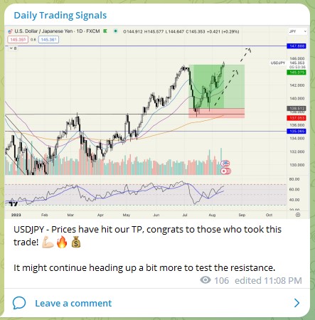
USDJPY – Prices have hit our TP, congrats to those who took this trade! 💪🏻🔥💰
It might continue heading up a bit more to test the resistance.
After trading for 18 years, reading 1500+ books, and mentoring 1000+ traders, I specialise in helping people improve their trading results, by using tested trading strategies, and making better decisions via decision science.