Analyzing Price Patterns on Multiple Timeframes
Join our Telegram channel for more market analysis & trading tips: t.me/synapsetrading
Another interesting feature of price patterns is how they play out across different timeframes.
For example, if you see a pattern on the current timeframe chart you are using, have you wondered how it would look like on a timeframe which is higher or lower?
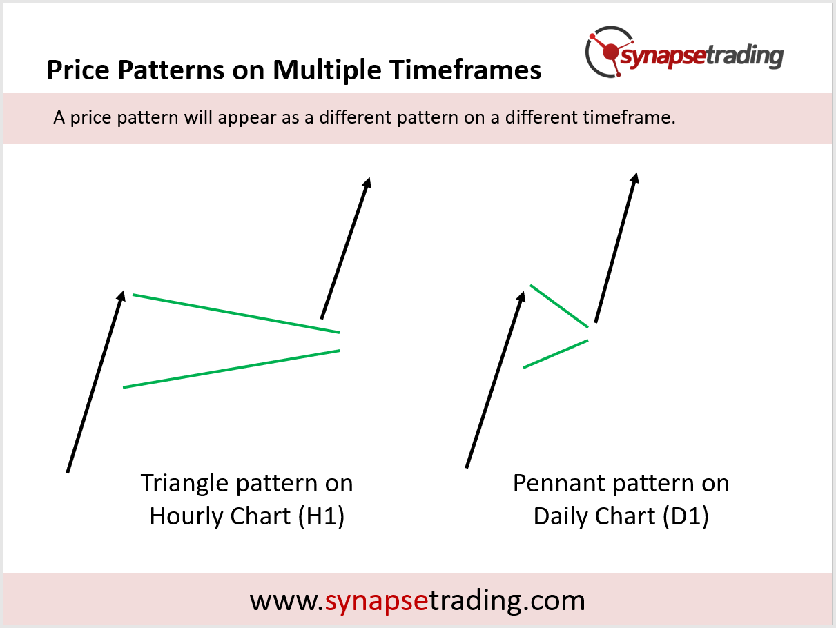
Looking at the example above, on the left we have a chart which is in the hourly timeframe, and on the right we have the same chart in the daily timeframe.
When you transit from an hourly timeframe to a daily timeframe, what happens is that the prices get “compressed”, because now all those hours are packed into one day.
So in this chart, we see the triangle pattern on the hourly chart get compressed into a pennant pattern on the daily chart.
So you might be thinking, how is this relevant to actual trading?
Well, for starters, this give you more context.
When you are studying the chart pattern on the current timeframe, thinking about how the pattern on the larger timeframe looks like literally gives you a bigger picture, allowing you to strategize your trades better.

If you would like to learn all the different price chart patterns, also check out: “The Definitive Guide to Trading Price Chart Patterns”
 Our flagship mentoring program is suitable for both beginners and advanced traders, covering the 4 strategies which I used over the past 15 years to build up my 7-figure personal trading portfolio.
 If you're looking for a reputable brokerage that covers all products (SG stocks, US stocks, global stocks, bonds, ETFs, REITs, forex, futures, crypto) and has one of the lowest commissions, this is what I currently use.
After trading for 18 years, reading 1500+ books, and mentoring 1000+ traders, I specialise in helping people improve their trading results, by using tested trading strategies, and making better decisions via decision science.


Leave a Reply
Want to join the discussion?Feel free to contribute!