How to Read Price Charts (Candlestick Charts)
Join our Telegram channel for more market analysis & trading tips: t.me/synapsetrading
As we mentioned in the previous chapter, there are buyers and sellers, and a transaction happens when both a buyer and seller agree to transact at a particular price.
As the number of buyers and sellers in the market vary, so does the supply and demand, which causes the price to change continuously.
A price chart is simply a way to visually represent all the transactions that take place for a particular product, over a certain period of time. By plotting it out, it makes it easier for us to study the price trends over time.
While there are many types of price charts, such as bar charts, line charts, renko charts, kagi charts, etc, the most commonly used chart nowadays is the candlestick chart, so I will be using it for all my examples.
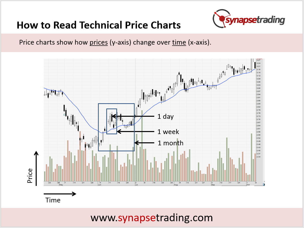
In the example above, you can see that prices are plotted as the y-axis, while time is plotted as the x-axis, so as we view the chart from left to right, we are observing how prices change over time.
Since this is a daily chart, 1 bar represents 1 full day of transactions. In trading terminology, we will say that the chart timeframe is the daily timeframe.
Some common timeframes include M5 (5 minutes), M15 (15 minutes), M30 (30 minutes), H1 (1 hour), daily (1 day), weekly (1 week), monthly (1 month), etc.
In the same example above, you can see that if I switch to a 1 week (5 trading days) timeframe, all that data in the box will be compressed into 1 bar. And if I switch to a monthly timeframe, all the data in the 1 month box will be compressed into 1 bar.
If you look at the bottom of the chart, you will see red and green bars, these represent the volume, which is the number of transactions that occur in that period of time corresponding with the price change.
Generally, the bar is green if price closed higher (relative to the close of the prior bar), and it is red if the bar closed lower.
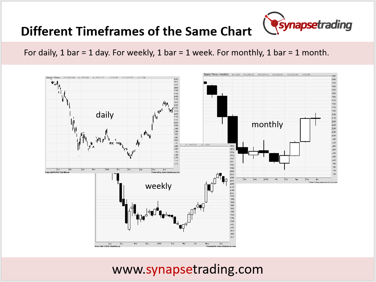
So this is how the same chart will look like as I toggle between the daily chart, weekly chart, and monthly chart.
As you go to a higher timeframe, you will notice that the chart gets “cleaner” and less granular, which makes it easier to study long-term trends by removing the noise, but on the downside it contains less data.
Personally, for my own trading, I like to stick to the daily chart, because it works well for swing trading.

If you would like to learn how to get started in trading, also check out: “The Beginner’s Guide to Trading & Technical Analysis”
 Our flagship mentoring program is suitable for both beginners and advanced traders, covering the 4 strategies which I used over the past 15 years to build up my 7-figure personal trading portfolio.
 If you're looking for a reputable brokerage that covers all products (SG stocks, US stocks, global stocks, bonds, ETFs, REITs, forex, futures, crypto) and has one of the lowest commissions, this is what I currently use.
After trading for 18 years, reading 1500+ books, and mentoring 1000+ traders, I specialise in helping people improve their trading results, by using tested trading strategies, and making better decisions via decision science.


Leave a Reply
Want to join the discussion?Feel free to contribute!