

Intermarket Analysis: How the Dollar, Commodities, Bonds and Stocks Move Together
Want the daily routine? Get the free 15-Minute Swing Trader’s Checklist. Get it free →
Four big markets pass pressure along a chain. Here is how the chain works, and the one link that changed after 2020
Published: 17 October 2026 · Last updated: 17 October 2026 · By Spencer Li, CFTe
You are looking at a stock index chart that looks healthy. Higher highs, higher lows, a clean uptrend. But bond prices have been sliding for 3 months. Should that worry you?
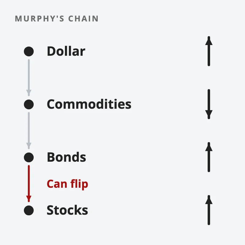
Intermarket analysis says it should, a little. Intermarket analysis is the study of how 4 big markets push on each other: the US dollar, commodities, bonds and stocks. The classic version comes from John Murphy’s 1991 book Intermarket Technical Analysis. In his chain, a rising dollar tends to push commodity prices down. Falling commodities ease inflation, so bond prices rise. And rising bonds tend to lift stocks. Near a market top, bonds usually turn down first.
Murphy’s own picture for it: “Trying to trade the markets without intermarket awareness is like trying to drive a car without looking out the side and rear windows.”
But one link in that chain has flipped more than once since 2000. So it works best in 3 steps. Read the chain. Work out which kind of shock is driving markets. Then let the chart of the market you trade make the actual decision.
What does intermarket analysis actually look at?
Murphy opens his first chapter with a simple claim. The US stock market “doesn’t trade in a vacuum.” Stocks are heavily influenced by the bond market. Bonds are moved by commodity prices. And commodities, in turn, depend on the trend of the US dollar.
He treats commodities as the missing link. In his words, the biggest breakthrough “lies in the recognition of the close linkage between commodity markets, measured by the CRB Index, interest rates, and bond prices.” The CRB Index is a basket of commodity futures, so it works as one number for the whole commodity sector.
Do note how Murphy ranks the method. Intermarket work is background. The main analysis still happens on the chart of the market you trade. He puts it plainly: “Traditional technical analysis still has to be applied to the markets on an individual basis, with primary emphasis placed on the market being traded.”
So intermarket analysis is a context layer. It tells you whether the wind is at your back or in your face. The chart still tells you where to enter and exit.
How does the chain work, link by link?
There are 4 relationships worth knowing. Each one has a usual direction, a usual leader, and a known way of breaking.
The dollar and commodities move in opposite directions. Most commodities are priced in US dollars, so a stronger dollar tends to weigh on them. Gold reacts fastest. Murphy’s dated examples line up almost exactly: the 1985 gold bottom came with the dollar peak that same year, and the December 1987 gold top came with the dollar bottom. The broad commodity index lags much further behind, often by months.
Commodities and bonds move in opposite directions. Rising commodity prices mean rising inflation, inflation pushes interest rates up, and bond prices fall when rates rise, which is why the 2 sectors usually move in opposite directions on the chart. Murphy cites a 1988 study by Powers Research that found the CRB Index and 10-year Treasury yields were correlated at +82% from 1978 to 1987. Commodities led yields by about 4 months.
Bonds and stocks, in Murphy’s era, moved together. And bonds usually moved first. In his words: “The bond market usually turns first. Near market tops, the bond market will usually turn down first. At market bottoms, the bond market will usually turn up first.”
His clearest case is 1987. The bond market broke down in April 1987. Stocks kept rising and topped in August 1987, 4 months later. Then came the October crash.
The whole chain runs as a loop. Higher rates eventually pull the dollar up, and a rising dollar starts the cycle again.
| Pair | Usual relationship | Who tends to lead | Murphy’s dated example |
| Dollar and gold | Opposite directions | Neither, they turn together | 1985 gold bottom came with the dollar peak |
| Dollar and broad commodities | Opposite directions | Dollar, with a long and variable lag | Dollar fell from 1985, commodities rallied hard only in April 1987 |
| Commodities and bonds | Opposite directions (in price) | Commodities, by about 4 months | +82% correlation of commodities and yields, 1978 to 1987 |
| Bonds and stocks | Murphy’s era: same direction | Bonds, by months | Bonds broke in April 1987, stocks topped in August 1987 |
If you want a short daily routine that puts this kind of context before every trade, our free 15-Minute Swing Trader’s Checklist covers it. Get the free checklist →
Why did the bond and stock link flip?
Now for the part that Murphy’s 1991 book could not have covered.
A trader asked on Reddit: “Are stocks and bonds positively or negatively correlated?” The honest answer is both, depending on the decade.
From roughly 2000 to 2020, the stock and bond correlation was negative, so when stocks fell, bonds usually rose, which is what made bonds the go-to hedge for anyone holding stocks. Many traders came to see that as the normal state of things. Then in 2021 the link turned positive. In 2022, stocks and bonds fell together, and the classic stock and bond mix had nowhere to hide.
The research behind this, from both academics and investment firms, points to one driver. It depends on which kind of shock dominates.
- Growth shocks (recession fears): stocks fall, investors expect rate cuts, and bonds rise. The two move in opposite directions.
- Inflation shocks (hot inflation prints): rates rise, so bonds fall, and higher rates hurt stocks too. The two move together.
And since the 1960s, the correlation has been positive more often than not. Murphy’s world of the 1970s and 1980s was an inflation world, which is why his bonds and stocks moved together. The 20 years after 2000 were the unusual stretch.
Even Murphy saw the link invert for a few days. In the October 1987 crash, money fled into Treasuries as the crash began. He wrote: “At such times the normal positive relationship of bonds and stocks is temporarily disturbed.”
So before reading any bond signal, you need to know which world you are in. A CPI release is often where you find out.
How do you use intermarket analysis without overtrading it?
The method is 3 questions, asked in order.
1. Which way is each market trending? A weekly chart of 4 things is enough: a dollar index, a broad commodity index, a long-dated government bond price, and the stock index you trade. The question for each is simple: rising, falling or flat?
2. What is the market afraid of this month? If stocks are selling off on inflation and rate news, bonds will probably fall with them, and the rising yields that come with it become a headwind for stocks as well. If stocks are selling off on growth fears, bonds are more likely to rally. In that regime, falling yields can be a recession warning rather than good news.
3. What does the market you trade say? Murphy’s rule for a conflict is clear. When the chain and the chart disagree, “traditional analysis still takes precedence but with increased caution.” He also wrote that “buy and sell signals for stocks are given by the stock market itself.” Your own chart, read through market structure, still sets the entry and the stop.
The chain works best as a guide to how much risk the backdrop supports, rather than which way to trade. Murphy framed it the same way: intermarket analysis “warns traders when they can afford to be more aggressive and when they should be more cautious.”
What are the limits of intermarket analysis?
There are 3 worth knowing before you lean on it.
The leads are long and they vary. Bonds led stocks by 4 months in 1987. The dollar fell for almost 3 years from 1985 before bonds finally broke in the spring of 1987. Murphy himself said the long leads are “less helpful to the short-term trader.” For a swing trader holding for days or weeks, the chain is a backdrop, never a trigger.
The links break for months at a time. From November 1980 to September 1981, bonds and commodities fell together, against the usual rule. Murphy noted the commodity collapse warned the anomaly would not last, and it did not.
The bond and stock sign can flip. That is the regime problem above. A rule built in one regime can give the opposite signal in the next.
For a wider view of how macro data feeds into trading decisions, our guide to news and economic indicators covers the main releases. And if gold is part of your portfolio, should you own gold looks at what it does and how to hold it from Singapore.
So, on your current chart, which way are bonds trending? And is the market more worried about inflation or about growth this month?
FAQ
What are the 4 markets in intermarket analysis?
The US dollar, commodities, bonds and stocks. John Murphy’s chain runs from the dollar to commodities, from commodities to bonds, and from bonds to stocks.
Do bonds lead stocks?
Often, near major turns. Murphy found the bond market usually turns down first near tops and turns up first near bottoms. In 1987, bonds broke down 4 months before stocks topped. The lead varies a lot. The sign of the link can also flip.
Why are stocks and bonds sometimes correlated and sometimes not?
It depends on which shock dominates. Growth scares push stocks down and bonds up. Inflation scares push both down. From about 2000 to 2020, growth shocks dominated. From 2021, inflation shocks did, and both fell together in 2022.
Why does a strong dollar usually hurt commodities?
Most commodities are priced in US dollars. A stronger dollar makes them more expensive for buyers using other currencies, which tends to weigh on prices. Gold usually reacts at the same time as the dollar turns.
Is intermarket analysis useful for swing traders?
Yes, as background. The leads are often months long, so it rarely gives a precise entry. It is most useful for deciding how much risk the market backdrop supports, while the chart of the stock decides the trade. It can also inform how you rebalance a portfolio when bonds stop acting as a hedge.
Go deeper
The chain only helps if you look at it before you trade, every time. The free 15-Minute Swing Trader’s Checklist has the daily routine, the questions to ask before every trade, and the five rules that protect your account.
About the author. Spencer Li is The 15-Minute Trader and the founder of Synapse Trading. He is a Certified Financial Technician (CFTe) with 15+ years of trading, run from 70+ countries. He holds a B.Acc and B.BM from SMU. Every trade he takes is public, dated, losses left in. He teaches low-risk swing trading in 15 minutes a day, one system for any market.
Educational content only, not personalised financial advice. Trading carries risk, including loss of capital. Past performance is not indicative of future results. Synapse Trading is not licensed or regulated by MAS.
Want the daily routine? Enter your email for the free 15-Minute Swing Trader's Checklist.
Free 5-page PDF, then occasional trading emails. Education only, not financial advice. Unsubscribe anytime. Kit stores your email in the US: see our privacy policy.
Want to learn the full method? The Trading Mastery Program teaches the 4 strategies I have traded since 2011. It suits beginners and experienced traders.
Rather follow the trades as they happen? Daily Trading Signals is our Telegram channel: my trade ideas with entry, stop and exit, and every trade is public.
Questions about this post? Ask in the free Telegram channel →
Educational content only, not personalised financial advice. Trading carries risk, including loss of capital. Past performance is not indicative of future results. Synapse Trading is not licensed or regulated by MAS.

